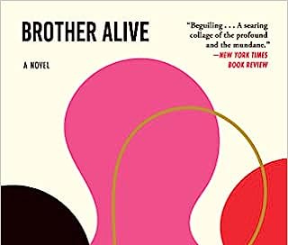
Mommy, where do book covers come from?
How publishers design book covers; the basic elements of an effective cover; and what's coming next in book cover trends (or at least what SHOULD come next, according to me).
Where do book covers come from?
Rather than type out the basics here, I’m going to laze out and link you to Penguin UK’s excellent explainer on cover design. Things work pretty much identically over here.
Go read that piece first before reading my list of highlights and additions below.
As hold music in the mean time, I’ll run you through the basics of what constitutes a good book cover—as in, one that sells itself effectively to consumers.
The elements of a good book cover
An effective book cover is formatted to pop online, in print media, and on shelves. Commercial books are sold to consumers primarily via the internet—and primarily to people who know what they want vs. people idly browsing. “Shelf appeal” is therefore not nearly as important as it used to be. Rather, THUMBNAIL APPEAL is what matters. Will it look good in a 2” by 1” image on someone’s laptop screen? Will it look good in a Hot Books of 2024 montage on the Washington Post’s review page, and will readers remember the design at the bookstore even if they don’t remember the title? Will the title be legible at that scale? Will the composition elements still look dynamic?
An effective cover communicates the book’s genre and communicates “you want to buy this” to readers in its intended audience. Beach-read romances need to look bright, sunny, and snacky. Space-opera sci-fi needs to look epic and serious; Douglas Adams-esque sci-fi needs to communicate “I’m sci-fi, but zany kind.” Book-club novels of the sort one is hoping Reese Witherspoon’s book club will pick up need to look Instagrammably *~*aesthetic~*~. And so on.
An effective cover has a long shelf life. We do not want the Shein Going Out Top here, metaphorically speaking, no matter how sparkly and appealing it may be. We want the graphic-design equivalent of linings, tencel, thick fabrics, and properly-sewn pockets.
An effective cover is one designed by a professional book cover designer. Not all covers designed by professionals are maximally effective, of course, but the ones that are are all designed by professionals.
OK, back to the Penguin piece.
Here’s what I’d like to emphasize, clarify, and add to their summary of how cover design works:
Cover design generally happens post-manuscript. Unless a book is on a crash schedule—meaning there’s around a year/year and a half (or less!) between when it goes under contract and when it hits bookstores—cover design doesn’t even start to happen until there’s a finished manuscript that’s gone into production. (In production = author and editor have resolved all substantive editorial issues, and the entire publishing team has turned their focus to designing / polishing the commercial product.)
Authors are not in charge of book cover design, but any competent agent will make sure they’re guaranteed cover consultation in their contract. This generally (but not necessarily) means that authors’ll be given a chance to help their editor mood board ideas before their editors share briefs with the art department. It generally (but not necessarily) means that art departments will come back with multiple design options for authors to consider. It definitely means authors are guaranteed a chance to say “ugh, I hate this” or “I like this, but I’d LOVE it if you just tweaked _________.”
It is completely normal for authors not to like all or part of their publisher’s cover concepts. If this is you, do not hesitate to speak up—to your agent first if you’re unsure what to say or do; to your agent and editor simultaneously if you are.
Although almost all publishing contracts technically give publishers the right to override authors on cover art, major publishers treat this in my experience as a protection against tasteless, tyrannical assholes—not as a carte blanche to be assholes themselves. Not once in my career has a publisher said “screw you” and refused to incorporate at least the broad strokes of my authors’ good-faith feedback. Publishers really, really want authors to love their covers, and most are willing to work with authors to the very limits of reason to ensure that’s the case.
Sometimes, authors love cover designs right away. That’s normal too! Either way!
If an author doesn’t like a cover concept—or even several—such dislike alone will not render them “difficult” in the eyes of even the most opinionated publishing teams. It’s definitely possible for authors to cross a line into energy-draining, inappropriate micromanagement—more on that in a sec—but registering honest concern and asking for change in a timely manner is not that.
If I’m one of those authors who dislikes my publisher’s proposed cover design, how do I communicate around this professionally?
The more grist and traction one can offer the other party in this kind of discussion, the more efficient and pleasurable it’ll be.
I recommend communicating about this issue—and all subjective conflicts of this sort—with clarity, empathy, flexibility, and trust for the professionals on the other side of the screen.
And here’s how you do that.
Keep reading with a 7-day free trial
Subscribe to How to Glow in the Dark to keep reading this post and get 7 days of free access to the full post archives.


